Headline
HeLLo and wel Come to the Usability AcaDemy! I am VanessaAnd to d a y I wiLl tell yo u something about the TYpo graphic.
You had problems reading the text? Don't worry, you are not the only person. It's because the font is very hard on the eyes and the spaces between them are too big. So, in general, we can say that typography has failed in a big way. But what is typography? I'll go into that in a little more detail.
What is typography?
"Typography is the art of finding correct spacing and proportions for texts.The primary goal of typography is to find a reader-friendly text design."
-C.D. Khazaeli, Crash Course in Typography and Layout (2005), p. 70
Very interesting, but what does that translate to? Simply put, typography is the appearance of text. One task of typography is to increase the readability of a text so that the content comes across understandably, and the other is to underscore the message of the text. This can be achieved through well thought-out proportions, fonts, font sizes and colors for the text. It is important to distinguish between micro- and macrotypography.
What is the difference between microtypography and macrotypography?
Microtypography
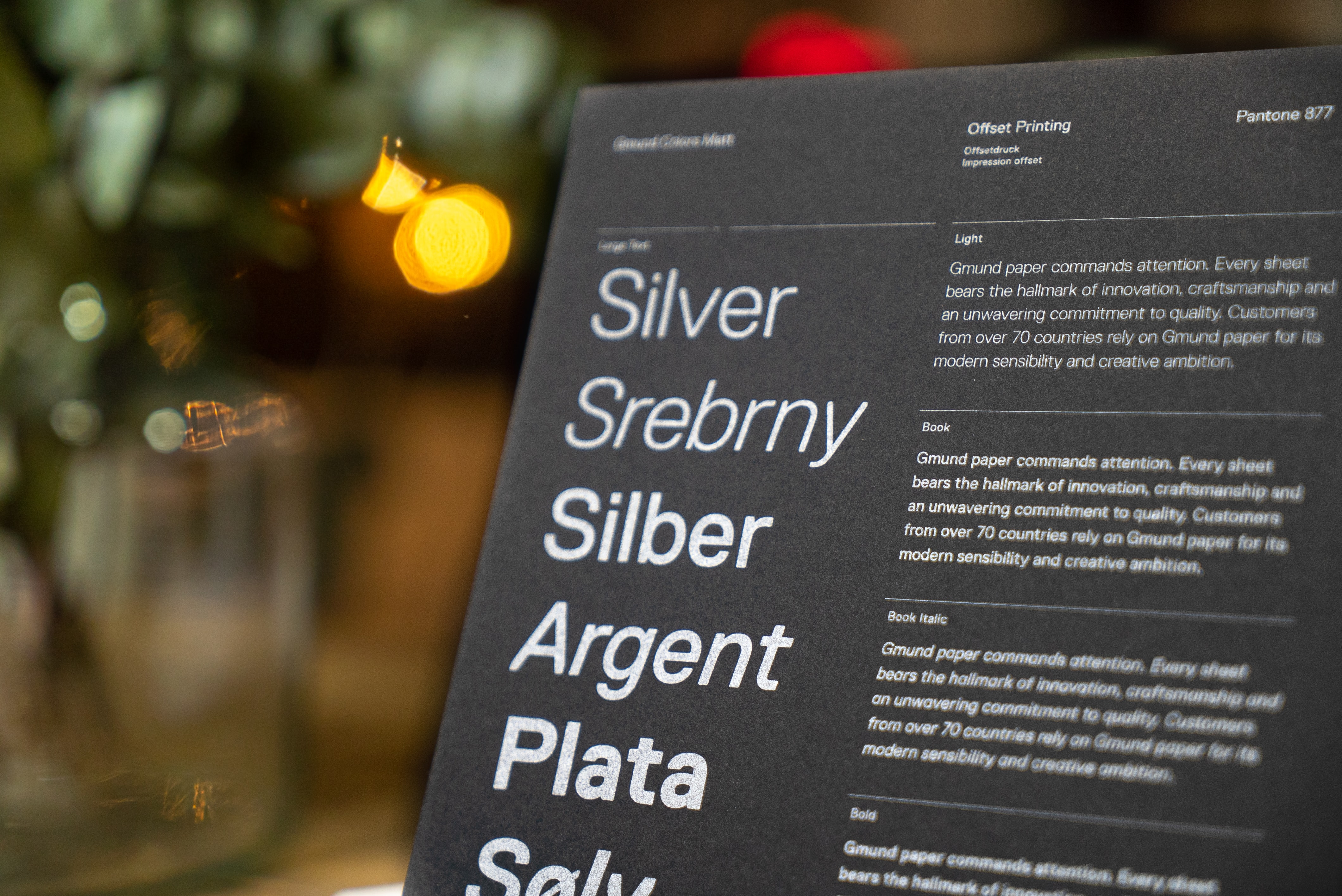
Microtypography, also called detailed typography, deals with the subtleties of the typesetting of a layout. Thus, it is responsible for the visual appearance and readability. Microtypography includes the following aspects, such as spacing, which describes the distance between individual letters. Spacing, the horizontal distance between individual characters, and ligatures, the connection of two or more letters to form a single letter, are also part of it. Likewise, word spacing, fonts and correct punctuation are also part of it.
Macrotypography
Macrotypography deals with the layout of the print or web page. Here, among other things, the page format, type area, but also font size, line spacing or the use and placement of graphic elements are determined. It is important to consider the relationship between printed and unprinted areas so that it does not appear too cluttered.
How does it influence us in everyday life? What effect do fonts have on us?
We encounter typography everywhere in everyday life. The cereal box tells us its contents, the exit sign where to go out and the street sign where to go. We unconsciously perceive all of this from our surroundings and it influences us. Whether it's the choice of font, the set of letters, or the use of punctuation marks. In this context, we also come to talk about the user experience. We already know the term from the article "Usability and User Experience: What's the difference?". If a logo or lettering of a calendar doesn't appeal to us, we won't buy it, maybe we also subconsciously associate something with that very font that we don't like. Therefore, the design medium of type cannot fail to have an effect on us.
Typography, calligraphy, lettering - what is the difference?
Since I have already explained typography in the upper part, I will only briefly discuss the other two types here.
Lettering
In short, lettering is the art of drawing letters and lettering. Here, the design of words, letters or sentences is in the foreground. There are no limits, whether different styles of writing, different shapes, squiggles or upper and lower case letters.
Calligraphy
Calligraphy is the high art of beautiful writing. It involves practicing writing individual letters and paying attention to the lines until you can do it perfectly.
Typography on the web - what you should pay attention to
Typography on the web has come a long way. We can finally use web fonts (licensed or free and paid fonts) and we don't have to use the standard fonts like Verdana, Tahoma or Arial. Still, we have to consider a few things when choosing, such as the different devices. Thus, the typography should be easily readable on smartphones, tablets or monitors. How you can achieve this, I'll tell you.
Always choose a font that is easy to read! You don't always have to follow your corporate design, as some fonts don't work on the web as they would in print. Fonts with strong serifs work well for this. For headlines, you can also choose more specific fonts, but still pay attention to readability, and for body text, you should mainly pay attention to readability.
Define H1-Hx and body text for yourself! You should define how the font & style; font size; line spacing, or line height and color should be. H1 (biggest headline) should be set only once, because of SEO.
Make sure you have a visual hierarchy! Set clear paragraphs between different elements, for example by subheadings, so that the reader is not flooded with information.
Do not use manual breaks! Because words are not automatically separated on the web, thus man


+49 631 3160 5793 ![]()
+49 631 3160 5793 ![]()
